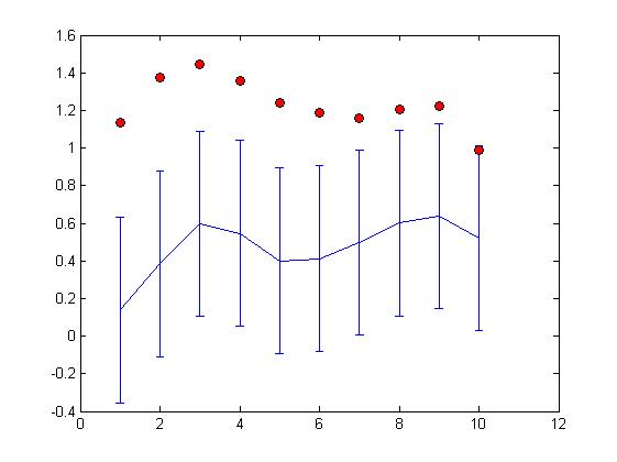
The solid black curve is the computer's best prediction of the original message. But we can't be sure!
Remember, this is a guess the computer has made by just looking at the three last messages, and knowing the layout of the desks. So we've also given a couple of ways of showing how sure/unsure we are. The red dots give another possibility for the original curve, that would also be pretty likely - in jargon, it has a high posterior probability . The vertical bars around the solid curve are another visualisation of the possible errors.
So how did we do? Well, we'll let you judge for yourself! The original message was:

Why did all this take us a while? There are some challenges with the ipad data. It has blue lines and black lines on a white background and not all of the blue curves are the same length, or are in the same positon on the page. So, I first filtered out all colours except for blue. Next, the curves that you see in the project video are a bit thinner than a finger mark; but not much thinner. Obviously mathematical functions don't really have a thickness. So, I found a line that passed through the centre of the blue curves. The result looked like this:

Then I wrote a few lines of code to place the curves in the centre of the page, and to stretch them out so that they covered the whole page. This gave these three curves:

From these three curves, we made the predictions that you see at the top of this post. We also asked the computer to guess the layout of desks, and it got it right. Well done everyone (computer included)!
No comments:
Post a Comment